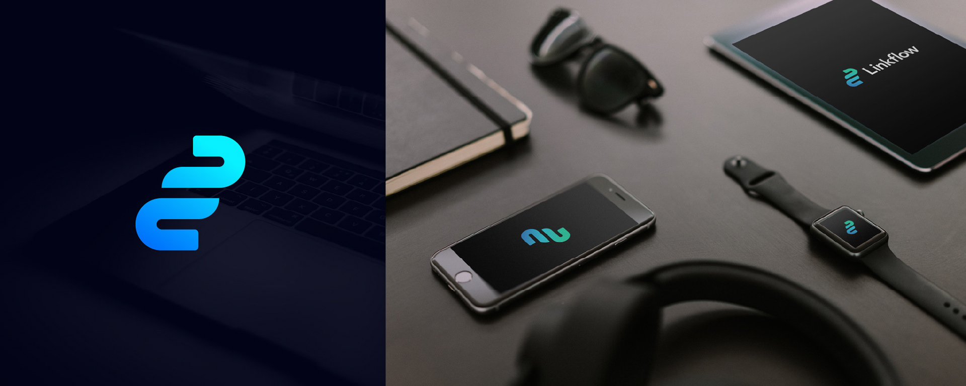
Linkflow
LOGO DESIGN PROJECT 2018
2018 was a somewhat busy year for me, and one of the projects that I was particularly proud of was the logo design I did for a digital marketing agency. They work with clients to help grow their organic traffic and improve keyword ranking and domain authority.
A simple icon was required to express a modern feel with links to the tech industry. I began researching existing businesses offering similar services to Linkflow, mainly to get a feel for the industry and understand how their brands work on various platforms.

KEY WORDS
Generating keywords is one of the most efficient ways to begin the journey of not only creating concepts for the logo itself, but for understanding and really getting to grips the brand and the client.
Minimal
Modern
Link
Tech
Simple
Geometric
Economical
Modern
Link
Tech
Simple
Geometric
Economical

After cycling through various concepts I finally landed on the notion of combining a knot icon to represent the idea of ‘linking’. I then wanted to give the design a feeling of flowing and fluidity; something a bit snake like.